Intro
Local elections paired with a relatively recent census present a unique opportunity to test the impact of locality-level predictors like quirks of demography on party support.
This is because while in a general election, the most granular level of data released publicly is an electoral district, which is circa 30,000 voters, local council elections provide information on town populations from a few hundred to a few thousand voters. We can use other data sources to collate demographic and environmental variables on these towns, and see if and how each varies with voting behavior. You can think of it as a haphazardly planned natural experiment, where properties of several things are varied by some amount, and where we also observe the result.
The bulk of these variables are what the NSO have released from the 2021 census, but I’ve also included other datapoints: a CORINE Land Cover dataset gives us proportions of different land use per town, and I’ve included more weird ones in the mix like accidents.
Distributional Regressions
The actual mechanics of the analysis is a regression using a Dirichlet distribution, or as the family is more broadly known, distributional regressions. The Dirichlet part is important because electoral outcomes in a town are composed of different vote shares for each party which must sum to 100%. This allows us to at a single-go model the impact of urban density on votes for PL, PN, and other parties.
I borrow heavily from this post applying the same idea to the 2018 Quebec elections by Lucas Deschamps.
A quirk of the Dirichlet distribution is that probabilities cannot be 0. Since not every town had a non PN/PL candidate, I overcome this by adding +1 to both the Other votes and total votes in each locality. Other than that, I scaled values that were not percentages to be in a 0-1 range.
minMax <- function(x) {
  (x - min(x)) / (max(x) - min(x))
}

df_eo_and_nso_politics <- data%>%
  mutate(pn_share = PN/(Valid+1),
         pl_share = PL/(Valid+1),
         other_share = (Others+1)/(Valid+1)) %>%
  mutate(rent_median = minMax(rent_median),
         accidents_2024= minMax(accidents_2024),
         population_density = minMax(population_per_km2))
Ultimately these are the variables tested:
form <- bf(cbind(pn_share, pl_share, other_share) ~
             unemployed_perc +
             perc_eng_first_lan +
             terraced_house+
             semi_fully_detached_house +
             other +
             maisonette +
             good_state +
             needs_minor_repairs +
             needs_moderate_repairs +
             property_owned_freehold +
             rent_median +
             non_maltese_males +
             population_density +
             property_1918_or_before +
             property_1919_1945 +
             property_1961_1980 +
             accidents_2024 +
             discontinuous_urban_fabric +
             land_principally_occupied_by_agriculture_with_significant_areas_of_natural_vegetation +
             sclerophyllous_vegetation,
             family = dirichlet)
These sorts of models are very intuitive in brms:
model <- brm(formula = form,
             data = df_eo_and_nso_politics,
             iter = 4000)
Plotting Conditional Effects
And as in the Quebec elections post, probably the most striking visual way is to plot the conditional effects, that is, if we hold all other predictors constant, what would dialing up the knob of this effect up and down change?
To do this, brms has an inbuilt conditional_effects function. I do want to customize the plot just a bit, so I’ll be passing output from it to this custom function:
plot_conditional_effects <- function(ce_res){

  name <- ce_res %>% names()

  out <- tibble(get(name, ce_res)) %>%
    select(1, "effect1__", "effect2__", "estimate__", "lower__", "upper__")

  plot_name <- out %>% names() %>% head(1)

  out %>%
    ggplot(aes(x = effect1__)) +
    geom_ribbon(aes(ymin = lower__, ymax = upper__, fill = effect2__), alpha = 0.2) +
    geom_line(aes(y = estimate__, color = effect2__)) +
    theme_minimal()+
    scale_fill_manual(values = c('pl_share' = '#EC7063',
                               'pn_share' = '#2980B9',
                               'other_share' = '#99A3A4'))+
    scale_colour_manual(values = c('pl_share' = '#EC7063',
                               'pn_share' = '#2980B9',
                               'other_share' = '#99A3A4'))+
    scale_x_continuous(labels = scales::percent)+
    ylab('Probability')+
    xlab(plot_name)+
    labs(colour='Party Effect')+
    guides(fill="none")+
    labs(title = plot_name)
}
I won’t bore you with all of them, but what we’re looking for is something like this when a variable has an effect. This example is the party shares as a function of the percentage of people in a town who say their first language is English, as opposed to Maltese.
conditional_effects(model, "perc_eng_first_lan", categorical = T) %>%
  plot_conditional_effects()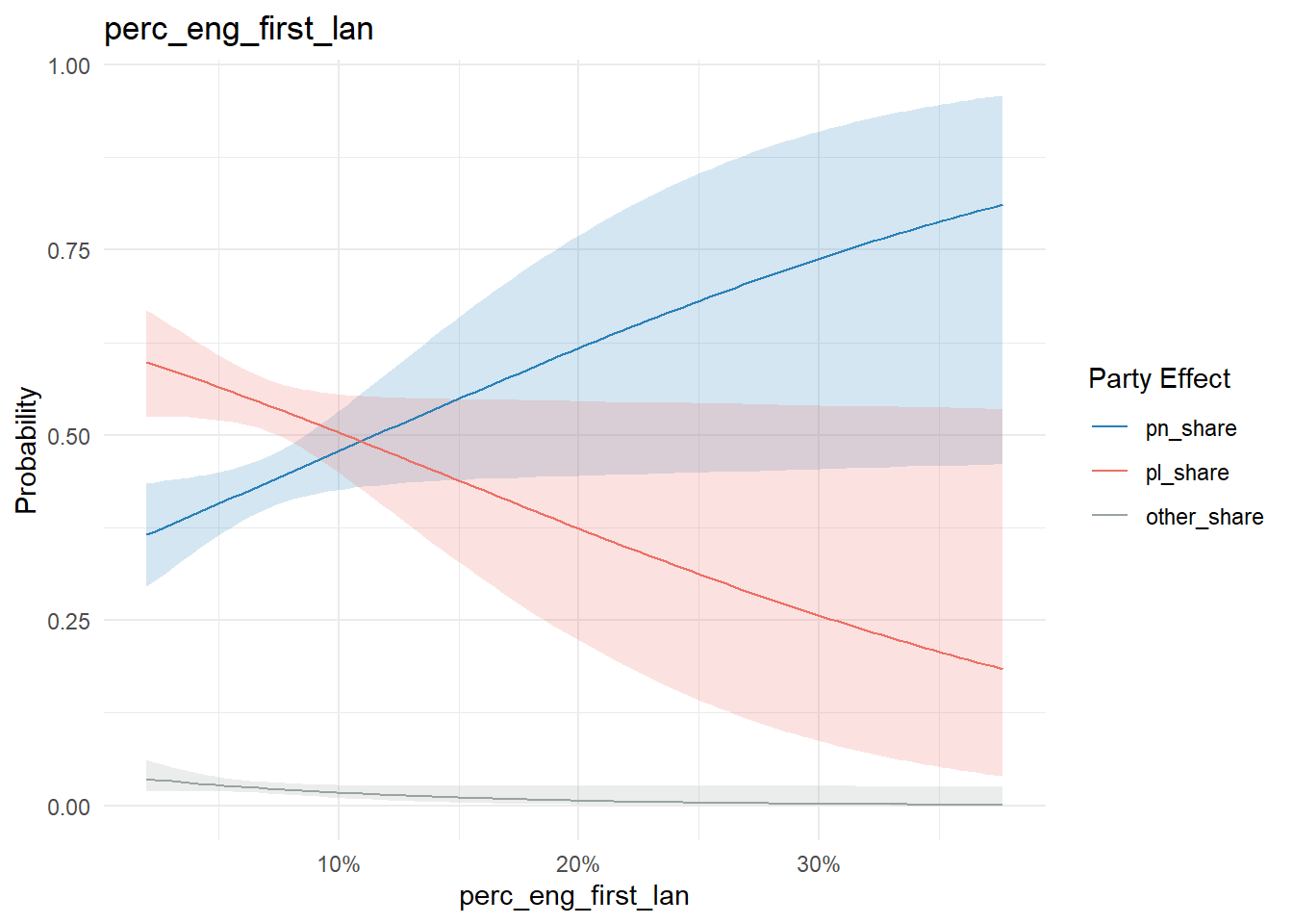
If an effect doesn’t change probability, the graph tends to be flat with no crossing. For instance, the proportion of people living in a terraced house in a town exhibits this pattern:
conditional_effects(model, "terraced_house", categorical = T) %>%
  plot_conditional_effects()
A curated list of some of the interactions:
conditional_effects(model, "unemployed_perc", categorical = T) %>%
  plot_conditional_effects()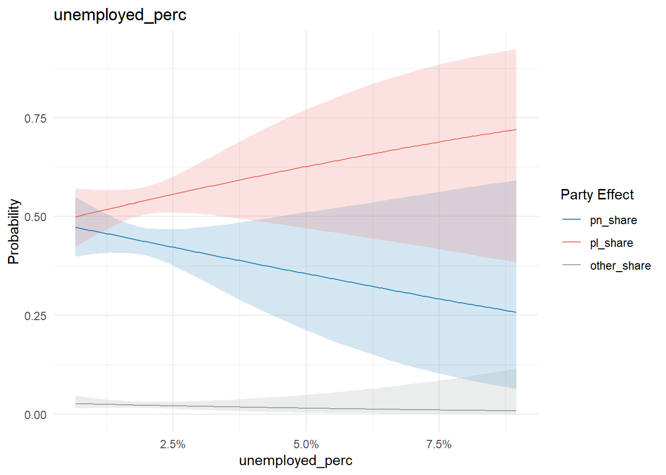
As unemployment goes up in a locality, PN vote share goes down.
Residence type is more complex to parse. Most exhibit a very weak if any effect:
conditional_effects(model, "maisonette", categorical = T) %>%
  plot_conditional_effects()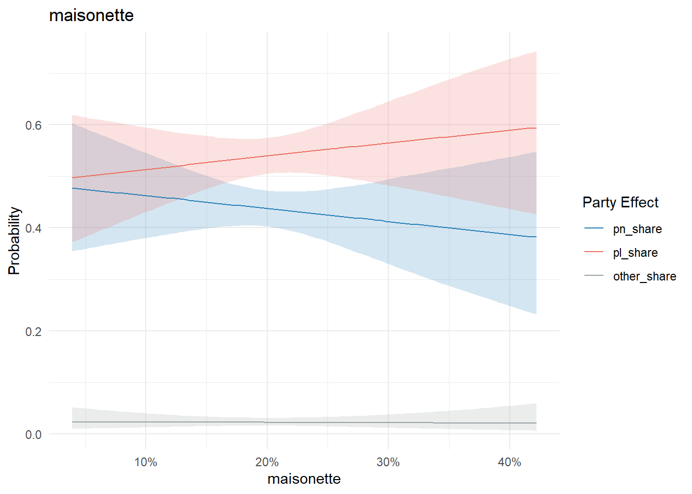
conditional_effects(model, "terraced_house", categorical = T) %>%
  plot_conditional_effects()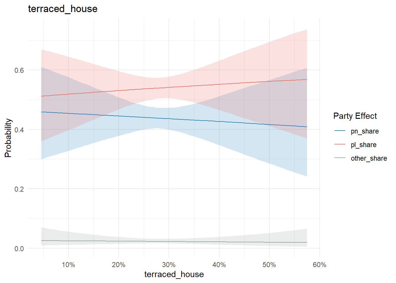
conditional_effects(model, "semi_fully_detached_house", categorical = T) %>%
  plot_conditional_effects()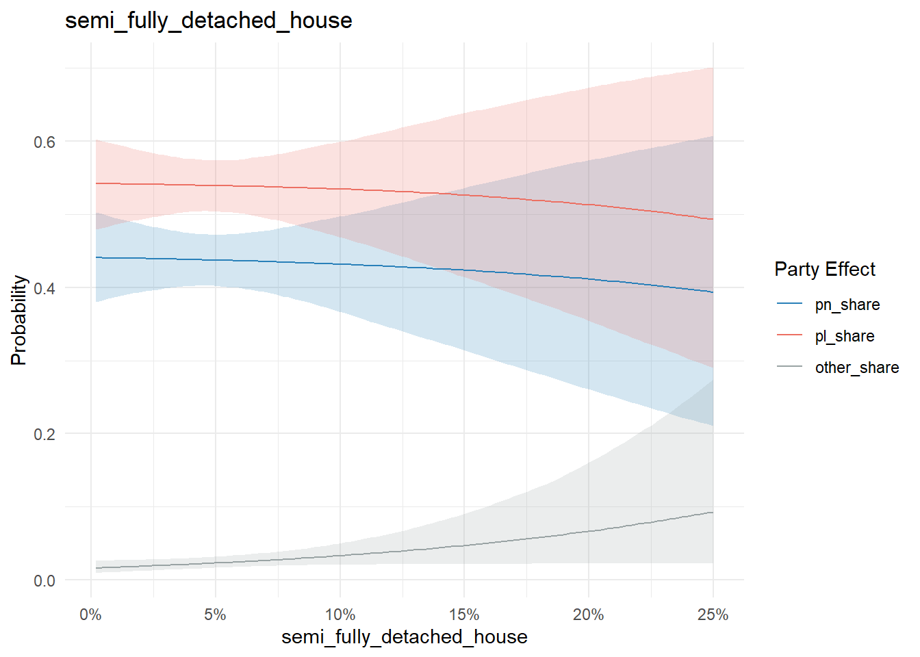
A residence type defined as ‘other’ by the census does have a stronger signal. But these types of properties are rare (less than 1% nationally), while Xghajra and Kalkara have 3-5 times this rate.
conditional_effects(model, "other", categorical = T) %>%
  plot_conditional_effects()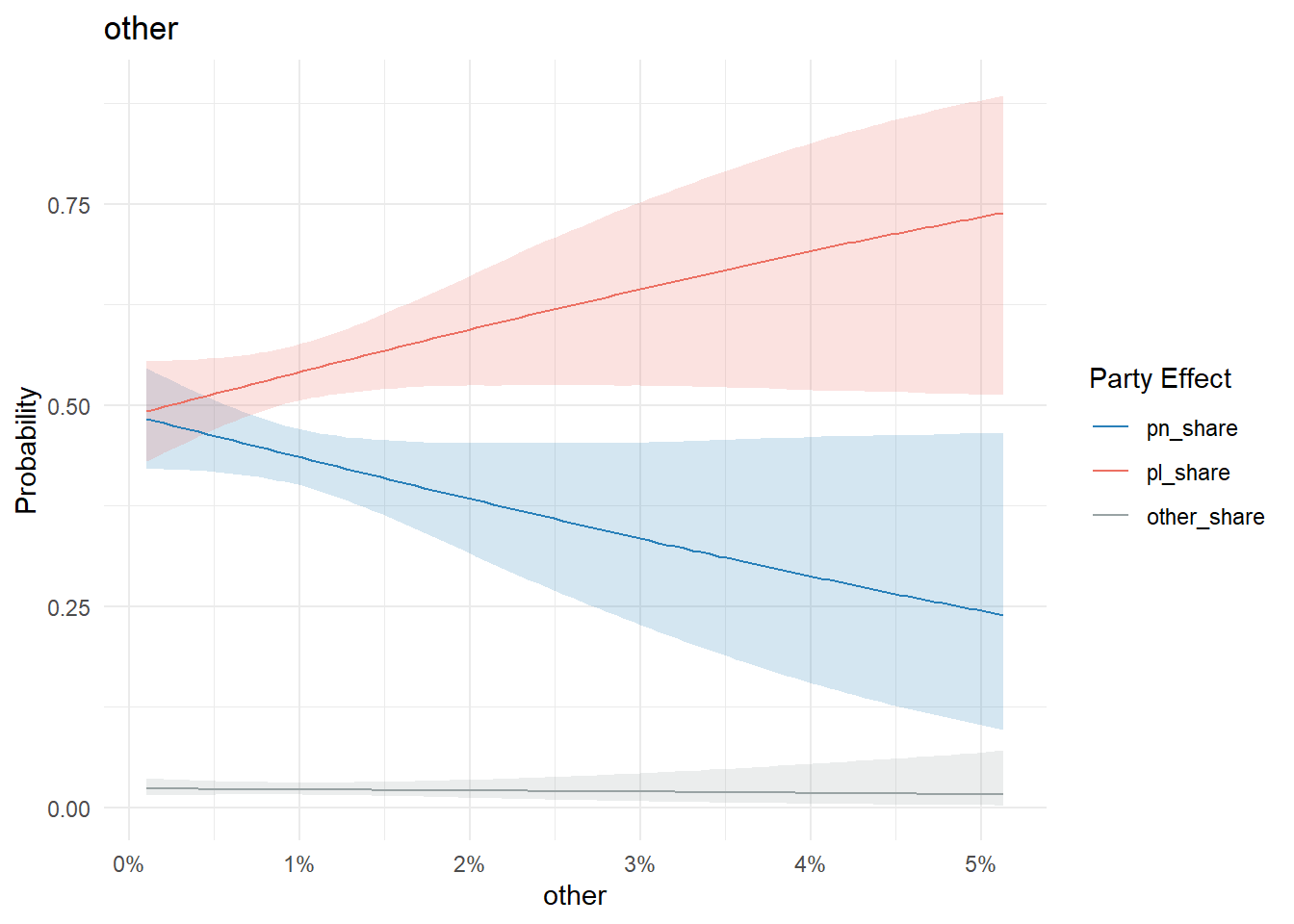
data %>%
  arrange(desc('other')) %>%
  head(10) %>%
  ggplot(aes(x=fct_reorder(locality.x, other), y=other))+
  geom_point()+
  coord_flip()+
  theme_bw()+
  scale_y_continuous(labels = scales::percent)+
  xlab(NULL)+
  ylab("Proportion of Properties defined by the census as being 'Other'")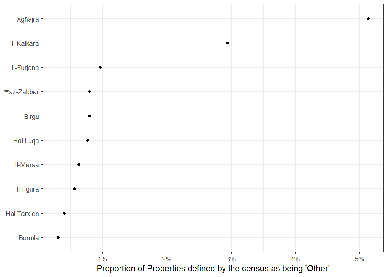
Similarly, nothing too conclusive on the property maintenance state or ownership/rent front:
conditional_effects(model, "good_state", categorical = T) %>%
  plot_conditional_effects()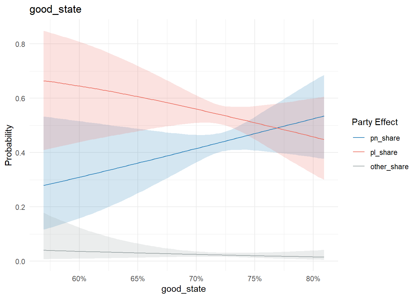
conditional_effects(model, "needs_minor_repairs", categorical = T) %>%
  plot_conditional_effects()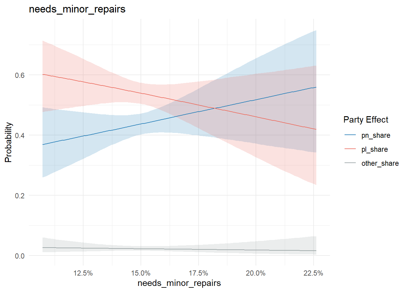
conditional_effects(model, "needs_moderate_repairs", categorical = T) %>%
  plot_conditional_effects()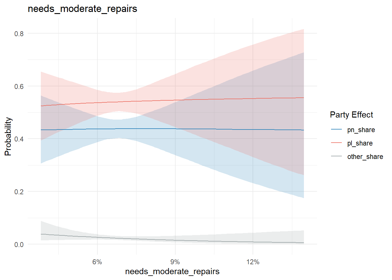
conditional_effects(model, "property_owned_freehold", categorical = T) %>%
  plot_conditional_effects()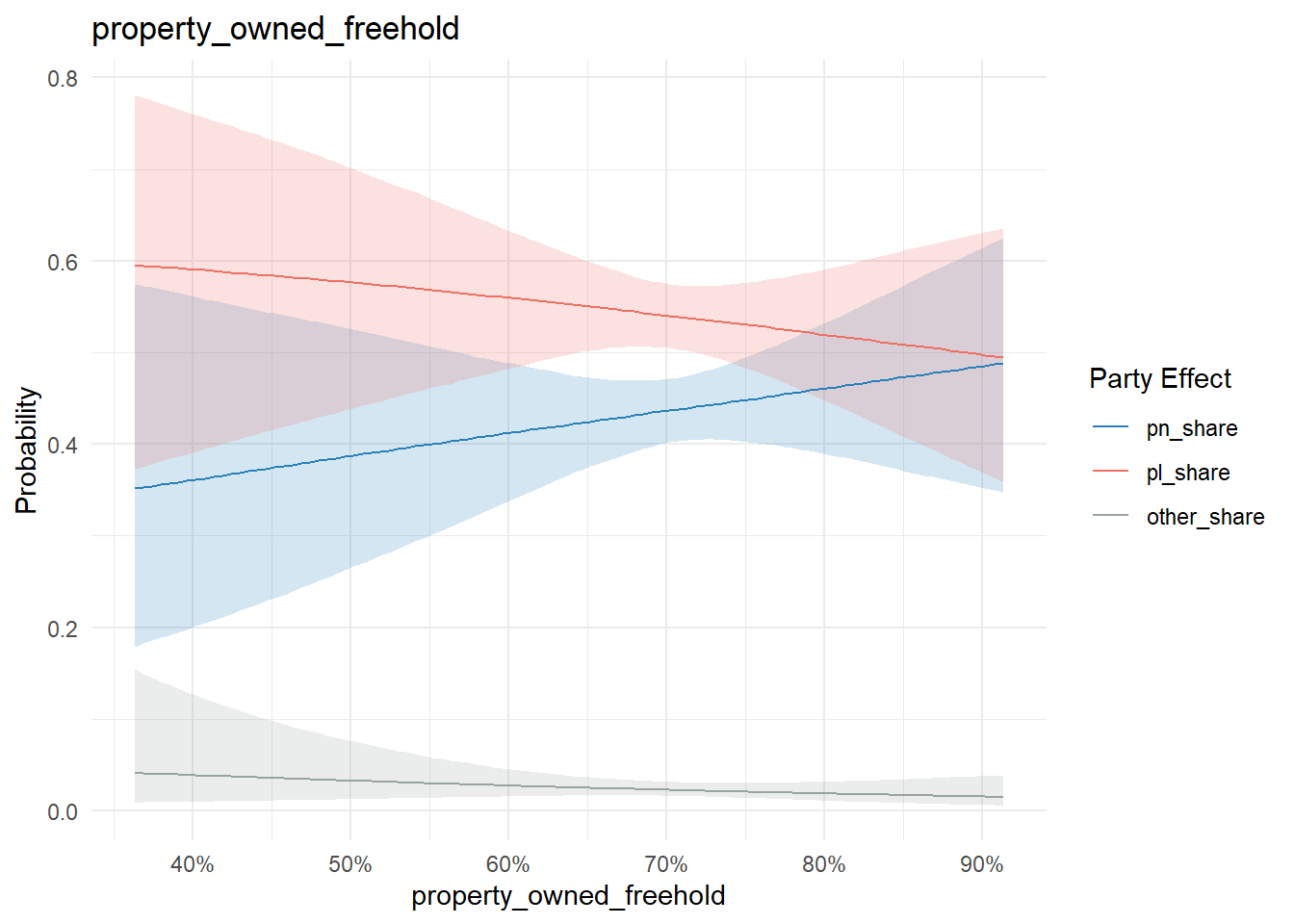
conditional_effects(model, "rent_median", categorical = T) %>%
  plot_conditional_effects()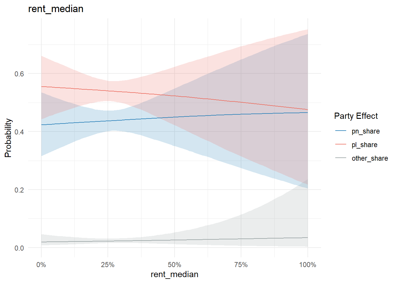
The proportion of non-Maltese males resident in a locality is interesting not so much because of the effects on the main parties, but the effects on other parties:
conditional_effects(model, "non_maltese_males", categorical = T) %>%
  plot_conditional_effects()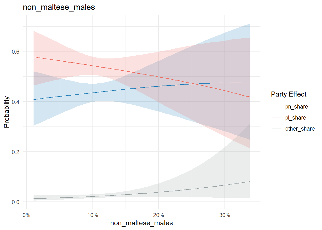
Population density and Q1 traffic accidents in 2024 are more meh:
conditional_effects(model, "population_density", categorical = T) %>%
  plot_conditional_effects()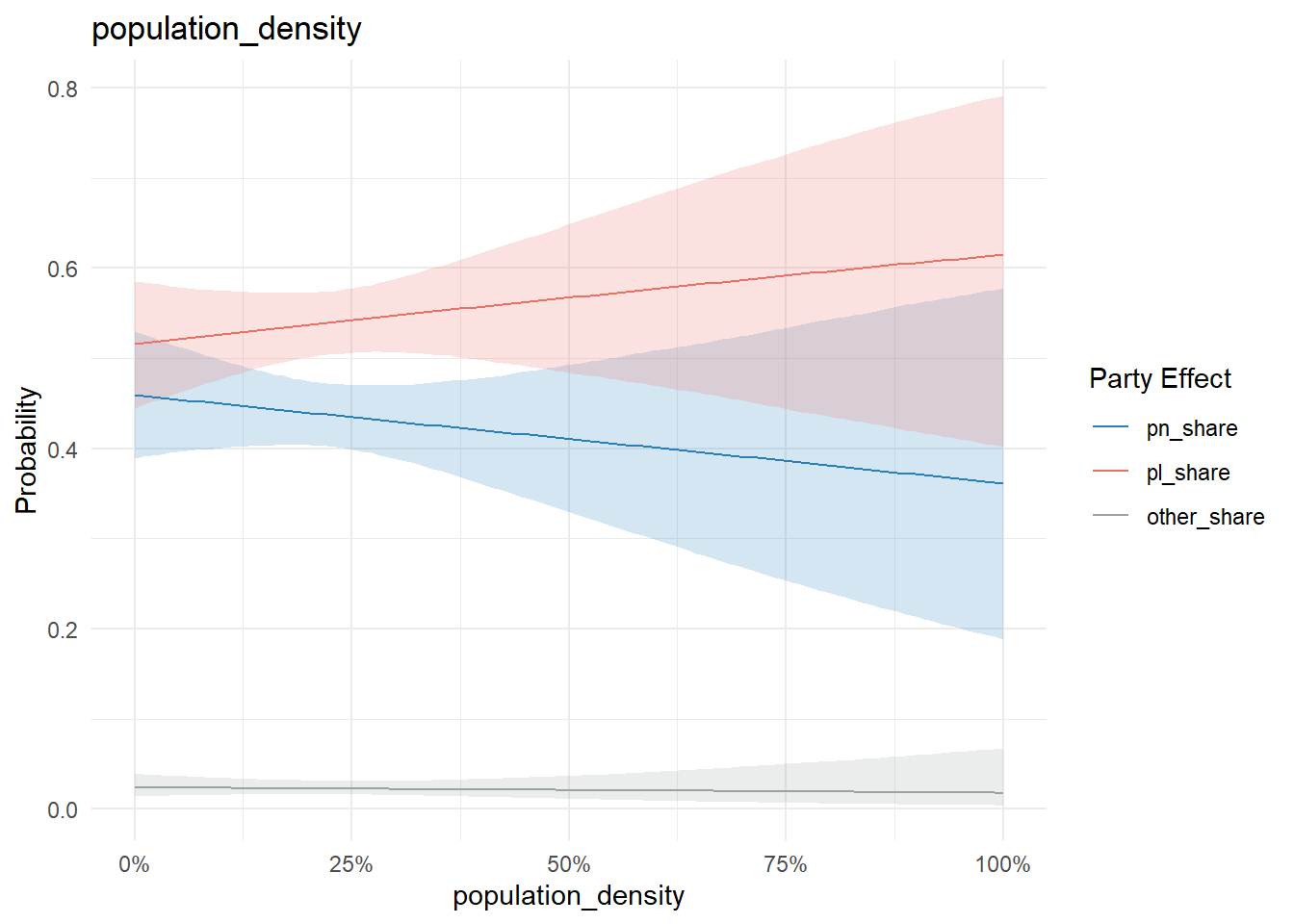
conditional_effects(model, "accidents_2024", categorical = T) %>%
  plot_conditional_effects()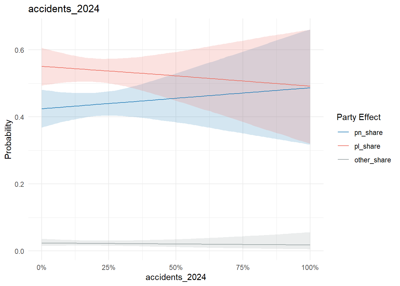
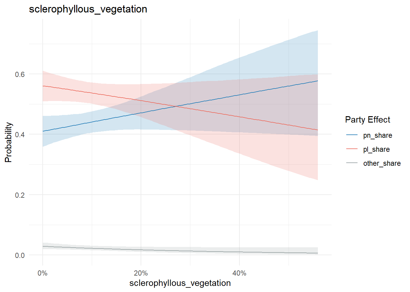
And locality land type:
conditional_effects(model, "discontinuous_urban_fabric", categorical = T) %>%
  plot_conditional_effects()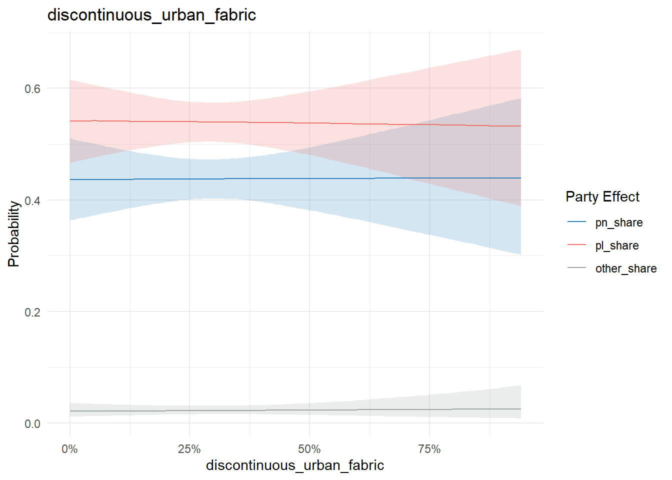
conditional_effects(model, "land_principally_occupied_by_agriculture_with_significant_areas_of_natural_vegetation", categorical = T) %>%
  plot_conditional_effects()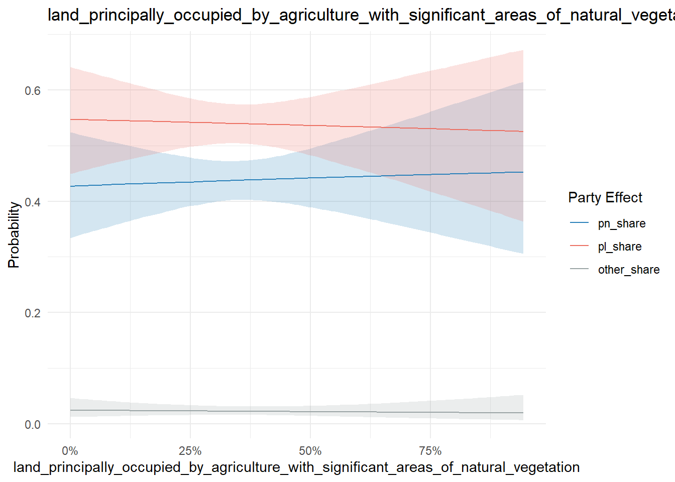
conditional_effects(model, "sclerophyllous_vegetation", categorical = T) %>%
  plot_conditional_effects()